


 Maecenas at ipsum quis massa rutrum gravida! Ut in varius orci. Pellentesque habitant morbi tristique senectus et netus et malesuada fames ac turpis egestas.
 Phasellus sed lectus nec risus posuere rhoncus sed et ligula. Sed gravida ornare turpis vel euismod. Phasellus quis tortor non lacus sodales rutrum sit amet non est
 Donec elit nulla, pulvinar nec porta sed, hendrerit eget metus. Suspendisse porttitor ligula non felis volutpat pretium? Praesent laoreet nisl a eros ultricies in lacinia
Showing posts with label gimp. Show all posts
Showing posts with label gimp. Show all posts

All right guys and gals, today is Monday which among others things means that it's time for my wallpaper tutorial here. I've been wondering what wallpaper should I use for today's tutorial and I made my mind like 5 mins ago, but I promise you you won't be disappointed.
So it's time to present you the wallpaper that you'll have after you've completed the tutorial. So I wanna hear loud claps for this vivid "Cosmos" wallpaper:

Looks stunning, right? (if you are dumb enough to say "NO", you shall be blood-eagled :D). Anyway, it's time I start with the tutorial already.
Step 1.
Download this .PNG file and open it with GIMP:
Step 2.
Create a new layer and fill it with solid black. Now click on Filters -> Noise -> HSV noise. Choose the following settings for the noise and click OK:

Now set the layer mode to "Screen" and Opacity to 50%
Step 3.
Create a new layer. Now choose the "Blend" tool and set gradient to "Full saturation spectrum CW". Now make a gradient like this:

Now set the layer mode to "Overlay" and you should see a nice effect:

Step 4.
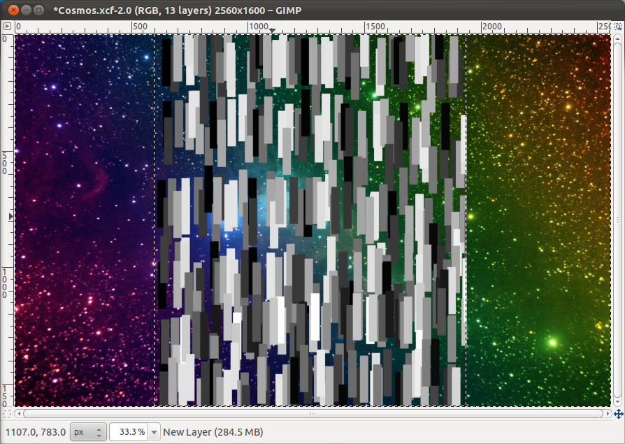
Download this brush and put the .gbr file in ~/.gimp-2.6/brushes Save the file as .xcf and than exit GIMP. Now open the .xcf file. Create a new layer and using the "Rectangle select" tool make a selection that is as high as the height of the and about 1/3 as wide. Now select the brush "rectangle long" in the "Paintbrush" tool and select the following settings for it: Size -> 0.50 , Brush Dynamic -> Random (just don't touch Hardness setting here) , Apply Jitter -> 1.0 , Use colour from gradient (standart).
Now simply brush horizontally about 6 times:
Now click "Filters -> Blur -> Montion Blur". Select the following settings for it and click OK:

Now you should have something like this:

Now select the "Scale" tool (Shift+T) and scale the layer to 1600x3000.
Now choose the "Rotate" tool (Shift+R) and rotate the layer to 45 degrees.
Now using the "Move" tool position the layer where you want it to be.
If done correctly you should have something that looks more or less this way:

Step 5.
Create a new layer. Now select the "Blend" tool and set gradient to "Full saturation spectrum CCW". Now stroke across the grey streams:

Set the layer mode to "Overlay" and you should see a nice effect like this:

Step 6.
The wallpaper is beginning to take shape, isn't it? Now it's time to make is bit more shiny by adding some layer mask.
First thing you need to do is set your foreground colour to black and the choose the "Blend" tool with gradient "Foreground to transparency".
Return the layer mode of the gradient for the streams to "Normal". Right click on that layer name and select Add Layer Mask. Select "White (full opacity) Now using the gradient tool make to gradient above the big red areas around the streams. This will remove the red parts. Again set the layer mode to "Overlay". Your image should now look like this:

Now we will the streams less dense. Click on the "Blend" tool and set the "Shape" to "radial". Right click on the name of the streams layer and again choose Add Layer Mask, select White (full opacity) Now using the gradient tool make some areas less visible. Just make a gradient somewhere and that layer will be less visible. For example I've made my streams look like this:

Step 7.
Now it's time for adding background mask. Create new layer and fill it with solid black. Now click "Filters -> Render -> Clouds -> Difference Clouds". There choose the following settings and click OK:

Now set that layer mode to "Grain merge". This will add some nice light and shadow effects:

Time for our second mask, so create a new layer and fill it with solid black. Again click "Filters -> Render -> Clouds -> Difference Clouds", but this time in the settings click "Turbulent" too and set detail to 1. Set the layer mode of that to "Overlay":

And time for the third and last mask. Needless to say create a new layer and fill it with solid layer and again click on "Filters -> Render -> Clouds -> Difference Clouds", so I am just gonna give you the settings for this third Clouds layer:

Now make another new solid black layer above the third cloud layer and set it's layer mode to "Overlay". Then right click on on and click "Merge Down", this will merge it with the third Cloud layer. Set the layer mode of the new layer to "Overlay" and Opacity to 25%. This will add even more darkness to the wallpaper:

Step 8.
All right, enough darkness, time to light things up a bit. Create yet another new layer and set white as your foreground colour. Now select the "Blend" tool and set the "Gradient" to "Foreground to transparency" and "Shape" to "Radial". Now paint white blobs where you think the wallpaper is too dark. For example here are my blobs:

Set that layer mode to "Overlay". This should add some lightness to the wallpaper:

If you think it's too dark, you can try duplicating the layer or instead of setting it to "Overlay" just lowering it's transparency.
Step 9.
That step is extremely easy. Create a new layer and fill it with solid black. Now click "Filters -> Light and Shadow -> Drop Shadow" and make a flare like this one:

Set this layer mode to "Screen"
Step 10.
Create a new layer. Now make sure your foreground colour is solid black. Select the "Blend" tool with "Gradient" to "Foreground to transparency" and "Shape" to "Radial" Make a black blob just above the light (upper) part of the lens flare, just like this:

Now set the layer mode to "Overlay" and you're done:

For those of you who will be interested here's my 2560x1600 .PNG file:
And my .XCF:
Before you’ve asked what the hell or who the hell is Polly - Polly is a twitter client. You can install it by executing the following command in terminal:

sudo add-apt-repository ppa:conscioususer/polly-daily && sudo apt-get update && sudo apt-get install polly
Do yourself a favor and give it a shot, with any luck it will blow your mind :)
And now back to the tutorial :P So anyway, when you're finished you will have an amazing wallpaper looking just like this:
And now back to the tutorial :P So anyway, when you're finished you will have an amazing wallpaper looking just like this:

Look gorgeous, doesn't it? So by now you should all be impatient to start, so here I go:
All right, first thing you need to do is to get my brushpack from here: http://ubuntuone.com/p/1AQ7/ and extract it to ~/.gimp-2.6/brushes
P.S. (There should only be files and not folders in that directory, so please after you unrar the archive copy the contents of the folders in it, but not the folders themselves)
Than you have to get those two images which you will need to use on later stage: http://ubuntuone.com/3aY7KTkwGfKN5Zj1eRObtJ
Step 1.
That step is nothing special - create new image with size 2560x1600 and fill the background with "BFD483" - light green
Step 2.
Open the file "old-hazard-stripes-texture.jpg" with GIMP, press CTRL+A to select it all and press CTRL+C to copy it. Now go back the the Polly wallpaper file and press CTRL+V to paste it. Click the new layer button in order for the stripes layer to become active. Now set the layer mode to "Overlay" and Opacity to "70%". You will now have a cool effect like this:

Step 3.


P.S. (There should only be files and not folders in that directory, so please after you unrar the archive copy the contents of the folders in it, but not the folders themselves)
Than you have to get those two images which you will need to use on later stage: http://ubuntuone.com/3aY7KTkwGfKN5Zj1eRObtJ
And also get this image too, which is also gonna be needed later:
Ok, that was easy, wasn't it? Then time to get to the real part.
Step 1.
That step is nothing special - create new image with size 2560x1600 and fill the background with "BFD483" - light green
Step 2.
Open the file "old-hazard-stripes-texture.jpg" with GIMP, press CTRL+A to select it all and press CTRL+C to copy it. Now go back the the Polly wallpaper file and press CTRL+V to paste it. Click the new layer button in order for the stripes layer to become active. Now set the layer mode to "Overlay" and Opacity to "70%". You will now have a cool effect like this:

Step 3.
Create two new layers. Fill the bottom one with solid white and the top one with solid black. Now make sure you've selected the bottom one and click Filters -> Render -> Clouds -> Difference Clouds. There check "Randomize" and click OK. Set this layer mode to "Overlay" and Opacity to "65%". Now select the top one and repeat the clouds thing-y, just this time check "Turbulent" also. Click ok and set the layer mode to "Overlay" again and Opacity to "75%". Now if you've done everything correctly the image should be similar to this one:

Step 4.
Now unzip the "PWR.tar.gz" file and open the file "Clouds.png" with GIMP, press CTRL+A to select it all and press CTRL+C to copy it. Now go back the the Polly wallpaper file and press CTRL+V to paste it. Click the new layer button in order for the stripes layer to become active. Now click Layer -> Scale layer and scale it to 2560x1600. Then click Filters -> Blur -> Gaussian Blur and apply 3px gaussian blur. Next up click Colours -> Desaturate -> there choose "Luminosity" and click OK. Now do Colours -> Invert. Set the layer mode to "Overlay" and Opacity to "40.0%". Now you should have a nicer looking image:

Step 5.
Now it's time to add the two finishing layers to the background of the wallpaper ... for now. Create two new layer with transparent background. Now select the bottom one and then choose the Paintbrush tool and grab some cool bubble brush (I used "BOKEH BRUSH"). Make sure your foreground color is white and start painting bubbles, just don't paint a lot of them (crazy man talking, I know :D). After you've painted them click on Filters -> Blur -> Gaussian Blur and apply 12.5px gaussian blur. You should have bubbles that look more or less like these ones:

Now change your foreground color to black and select the top layer. Grab a clouds brushes (I used Cartoon_Clouds_by_Yun_Zhen.abr) and paint a few big clouds. After you've painted them click on Filters -> Blur -> Gaussian Blur and apply 0.5px gaussian blur. You should have a lovely looking clouds like that:

Now set both layer mode to "Overlay", and set the Bubbles layer Opacity to "27%" and leave clouds layer Opacity to "100%". Now the wallpaper should look just like that:

Step 7.
This step is a walk in the park compared to the previous one. Open the "Parrot.png" from the "PWR.tar.gz" and press CTRL+A to select it all and press CTRL+C to copy it. Now go back the the Polly wallpaper file and press CTRL+V to paste it. Click the new layer button in order for the stripes layer to become active. Now duplicate that layer and move the copy bellow the original. Now make sure it is the copy you've selected and click Filters -> Blur -> Gaussian Blur and apply 7.5px gaussian blur. The wallpaper should now look suspiciously Polly-ish :D

Step 8.
That step could be a pain in the behind, but not to worry, I am sure you'll get it right. Anyway, grab the Path tool and make two paths that look just like the one shown in the picture:

Create a new layer and go to the "Paths" dialog in "Layers, Channels and Paths" window. Make sure your foreground is solid black. Now from the "Paths" dialog select your brush to be "Circle 13". Right click on the bottom path and click "Stroke Path", click OK with the default settings (e.g. Stroke Path to be 6.0px). Now go back to the "Layers" dialog and make sure it is the path with the stroke you've selected and click Filters -> Blur -> Gaussian Blur and apply 5.0px gaussian blur. Set the layer mode to "Overlay" and Opacity to "50%"
Repeat the same procedure for the top path too (from creating new layer to layer mode and opacity).
Now you should have two strokes on the image:

Step 9.
This step ain't gonna be much easier either, but you'll manage. So, again go to the "Paths" dialog and duplicate both paths. Now merge the duplicates. You should now have three paths:
 Now right click of the Path created by merging and click "Path to selection". Go back the the good old layers dialog and create a new layer below the two strokes ones. Than select the Bucket Fill tool and select "F3FF7F' as your foreground colour. Now click Select -> Invert. Now bucketfill the new selection:
 The last you need to do in this step is set the layer mode to "Overlay" and the Opacity to "30%" which will produce the following effect:

Step 10.
Almost there folks, just two more steps to go. So here comes the first one. Create two new layer. One between the two strokes layers and one above them. Select the first one. Now go to the "Paths" dialog and select the bottom path, right click and choose "Path to selection". Now choose black as your foreground color. Go back to the "Layers" dialog. Now choose the Bucket Fill tool and bucketfill the selection. Now press CTRL+A and than click Filters -> Blur -> Gaussian Blur and apply 2.5px gaussian blur. You should have something like this:
 Repeat the same procedure for the top path too, just this time use the second layer you created. After you've done it you should have an image that looks like this:
 Now all you need to do is set the layer mode to both layer to "Overlay" and Opacity to "45%". That will give you an ever cooler looking image:

Step 11.
This is the last step - mega YAY! Here's what you have to do - go to the "Paths" dialog and right click on the path you created from merging the two other some time ago -> choose "Path to selection". Now go back to the "Layers" dialog and create a new layer above all others. Select "747E00" as your foreground color and choose the Bucket Fill tool. Now bucketfill the selection and than click Filters -> Blur -> Gaussian Blur and apply 2.5px gaussian blur. The wallpaper should look like this now:
 Now all you have do to is set layer mode to "Overlay" and Opacity to "45%". That will complete the wallpaper:

And if you've made it this far - congrats, you are done! Now you can rejoice :D
For those of you who will ask about my .PNG and .XCF here they are:
2560x1600 .PNG from Picasa:
https://picasaweb.google.com/100530892038948253747/MyFirstAlbum#5664773173252690018
.XCF from UbuntuOne:
http://ubuntuone.com/4TEU3Ro5nJ1axsbiF1XbBs
Repeat the same procedure for the top path too (from creating new layer to layer mode and opacity).
Now you should have two strokes on the image:

Step 9.
This step ain't gonna be much easier either, but you'll manage. So, again go to the "Paths" dialog and duplicate both paths. Now merge the duplicates. You should now have three paths:


Step 10.
Almost there folks, just two more steps to go. So here comes the first one. Create two new layer. One between the two strokes layers and one above them. Select the first one. Now go to the "Paths" dialog and select the bottom path, right click and choose "Path to selection". Now choose black as your foreground color. Go back to the "Layers" dialog. Now choose the Bucket Fill tool and bucketfill the selection. Now press CTRL+A and than click Filters -> Blur -> Gaussian Blur and apply 2.5px gaussian blur. You should have something like this:


Step 11.
This is the last step - mega YAY! Here's what you have to do - go to the "Paths" dialog and right click on the path you created from merging the two other some time ago -> choose "Path to selection". Now go back to the "Layers" dialog and create a new layer above all others. Select "747E00" as your foreground color and choose the Bucket Fill tool. Now bucketfill the selection and than click Filters -> Blur -> Gaussian Blur and apply 2.5px gaussian blur. The wallpaper should look like this now:


And if you've made it this far - congrats, you are done! Now you can rejoice :D
For those of you who will ask about my .PNG and .XCF here they are:
2560x1600 .PNG from Picasa:
https://picasaweb.google.com/100530892038948253747/MyFirstAlbum#5664773173252690018
.XCF from UbuntuOne:
http://ubuntuone.com/4TEU3Ro5nJ1axsbiF1XbBs
First I wanna apologize for not being able to do my wallpaper article, but I've had way too much on my head. Anyway, what's important is that the last week is now past, so today is time to rock your socks with another wallpaper article :
So 10 ... 9 ... 8 ... 7 ... 6 ... 5 ... 4 ... 3 ... 2 ... 1 ... 0 ... Launch!
Houston we have a problem!
This article is milestone one, because I've finished my "Easy to make wallpapers", so I decided not rush with proceeding to "Medium" wallpapers, but to take it easy and tell a bit about every wallpaper, I've shown how to create to this point. So if my memory serves me correctly (I dearly hope that's the case) the first wallpaper I've shown you how to create was this one:
 The key word here is simplicity. It is doesn't have flashiness or loads of bling-bling in it, but it has that relaxing feeling due to the colours used it it. When I was creating it I was trying to get used to Gnome-Shell (failed miserably) and I wanted a wallpaper, that will fit the default Dark-ish theme, but I wasn't exactly keen on using the default "Stripes" wallpaper, so I said "Oh, screw it, I'm creating a wallpaper to use with that thing" and I ended up with that one. It is nothing so special, but it is nice way to escape the over-flashy and blingy wallpaper out there.
And so off we go to the next one, which was this lovely "Bubbles" wallpaper:
 See, everybody loves bubbles! No really, I have a theory that people who don't like bubbles and pancakes are just evil! Bubbles are cute, round and ... did I mention CUTE? Combing stylish dark background and colourful bubbles this wallpaper is one of my personal favorites. It has enough gloss, it is has colours, it is also by no means cluttered. Gee, it is just so freaking perfect. If I have to describe it with one word, it would be adorable. Just do yourself a major rajor favour and use it for some time, I promise, you'll love it!
If you thought this article couldn't get any better due to the overwhelming of the "Bubbles" wallpaper, see this Novacut wallpaper masterpiece:
 Designed specially to for the Novacut guys to congratulate them for achieving their kickstarter goal, I am extremely proud of that wallpaper. The wallpaper uses the Novacut Brand Identity by IZO. Lato font, the novacut purple and pink are all present. Due to the fact that Novacut will be cloud friendly, the wallpaper is also cloud-centric. It is just epic masterpiece. Do try it, you won't regret it :) If you wanna know more about Novacut check out our Novacut article :P
Ok, I might be a huge fan of Novacut (wallpaper), but it's time to move on to the next wallpaper which is also branded one. Remember that the blog name is "Linux Candy"? Good, then it's time to present to you the Linux Candy branded wallpaper:
 Like a said it is branded wallpaper, so it uses the Linux Candy branded colours and logo. I spend a lot of time creating that wallpaper, cuz I wanted it to have both - the light and airy feeling, but also to look colour rich. The result is (like you can all see) - WOW! Tell you what - that wallpaper is nothing, but piece of mind. Gradients, colours, splatters, gloss, etc... - it has it all. Just give it a shot and you'll understand my words.
OK, though both my branded wallpaper are some piece of work, it's time to go back the the good old non-branded wallpapers - YAY. And oh my, check this Green Stripes wallpaper out:

 I seriously have a crush on that one. Some time ago, I've been dying to stripes wallpaper and I decided to fire away and create one. It is nothing special creation wise, but it looks polished and just so ridiculously simple, that one can't help himself, but just love it. Splatters, transparency, nice colours and sweet lighting effects. The wallpaper has that all. Some piece of work, huh? I beg you to try it, it so ... man I don't know, just TRY IT :D
I admit, this next wallpaper, isn't exactly my brightest hour in wallpaper design, but some of you might actually like it. So I give you the Geometry wallpaper:
 If you though the Tree wallpaper was simple, check this out. It is almost as simple as wallpaper can be. The fun story here was that i found it in a folder of a software I was supposed to package, so I can't remember when I've created it. I can't tell you much about him, so I will just say it is S-I-M-P-L-E and leave it to you to judge it :P
Oh man, you can't imagine how good I feel now, after I'm beyond the "Geometry" thing-y, phew. So this next wallpaper is definitely to warm things up. Ready or not here comes my Ubuntu-ish wallpaper:
 It sticks to the new Ubuntu Light look and feel - aubergine and orange colours and dotty background. Also as you might have noticed it has the good old bubbles, which make everything look better. The light and darkening effects on the background add extra gloss and some weird 3D feeling to it. So my word for this one would be warm. For those of you who love Ubuntu (like me), this would be a great choice. ... And one more thing - this wallpaper looks stuning with Unity :)
Now it's time to remember the keyword that is always associated with the term"Open Source" - Freedom. It's time to DUEL (too much Yu-Gi-Oh) ... anyway, like I always saying it's time to present you the Freedom wallpaper:
 The one thing this wallpaper is not is simple, it is in fact quite the other way around, it is cluttered, but in a good way. The grey background and the chaotic red splatters give it very urban feeling. The 3D looking "Freedom" text and it's almost covered reflection add more the the urban look and feel. It is probably the most unique of all my wallpaper I've posted here to date. I would recommend to try it, some of you might not like it, but others are bound to love it.
Almost at the end. But there are still two more to go, so here is the first one - the amazing Ubuntu stripes wallpaper:
 This wallpaper might be just a simple modification on the default Gnome 3 Stripes wallpapers, but it is still one heck of a good wallpaper. I was inspired to created by this OMG! Ubuntu! article because the modification there wasn't as good as it could be, so I fired up and came up with this wallpaper, which is just lovely. I've been using it as my wallpaper for quite some time and trust me this means a thing or two :P
Ahhh, we are at the very end of the article, but I saved the most pink wallpaper for last. First I have to say that I hated myself while creating and writing the tutorial for that wallpaper, but I must say a few words for it too. So here goes - the Girlie wallpaper:
 Ok, for start it is just biased pink, but that comes as no surprise, because you know - it's name is "Girlie" :D Man, I don't and I won't talk about this pink thing, it is just PINK (as you MIGHT have noticed). So please, if you are a guy - do not, I repeat DO NOT use it! If you are a girl - well than have fun using it.
So I guess all I have ton say now is "Bye, bye" or something similar, but because I'M COOL you want get "Bye, Bye" from me :D ... See ya :D
So 10 ... 9 ... 8 ... 7 ... 6 ... 5 ... 4 ... 3 ... 2 ... 1 ... 0 ... Launch!
Houston we have a problem!
This article is milestone one, because I've finished my "Easy to make wallpapers", so I decided not rush with proceeding to "Medium" wallpapers, but to take it easy and tell a bit about every wallpaper, I've shown how to create to this point. So if my memory serves me correctly (I dearly hope that's the case) the first wallpaper I've shown you how to create was this one:

And so off we go to the next one, which was this lovely "Bubbles" wallpaper:

If you thought this article couldn't get any better due to the overwhelming of the "Bubbles" wallpaper, see this Novacut wallpaper masterpiece:

Ok, I might be a huge fan of Novacut (wallpaper), but it's time to move on to the next wallpaper which is also branded one. Remember that the blog name is "Linux Candy"? Good, then it's time to present to you the Linux Candy branded wallpaper:

OK, though both my branded wallpaper are some piece of work, it's time to go back the the good old non-branded wallpapers - YAY. And oh my, check this Green Stripes wallpaper out:


I admit, this next wallpaper, isn't exactly my brightest hour in wallpaper design, but some of you might actually like it. So I give you the Geometry wallpaper:

Oh man, you can't imagine how good I feel now, after I'm beyond the "Geometry" thing-y, phew. So this next wallpaper is definitely to warm things up. Ready or not here comes my Ubuntu-ish wallpaper:

Now it's time to remember the keyword that is always associated with the term"Open Source" - Freedom. It's time to DUEL (too much Yu-Gi-Oh) ... anyway, like I always saying it's time to present you the Freedom wallpaper:

Almost at the end. But there are still two more to go, so here is the first one - the amazing Ubuntu stripes wallpaper:

Ahhh, we are at the very end of the article, but I saved the most pink wallpaper for last. First I have to say that I hated myself while creating and writing the tutorial for that wallpaper, but I must say a few words for it too. So here goes - the Girlie wallpaper:

So I guess all I have ton say now is "Bye, bye" or something similar, but because I'M COOL you want get "Bye, Bye" from me :D ... See ya :D